A lot has happened since my previous update nearly a month ago. The main area of my focus has been switching from a top down view to something more isometric (think games like Earthbound), and the perspective challenges that are associated with that. I’ve also added a lot of new objects, tiles, and items (including various shops). Making this game has really opened my eyes to just how many assets and things of the like are required for not just indie-games like this, but professionally done AAA titles as well, and how difficult and tedious asset creation can be at times.
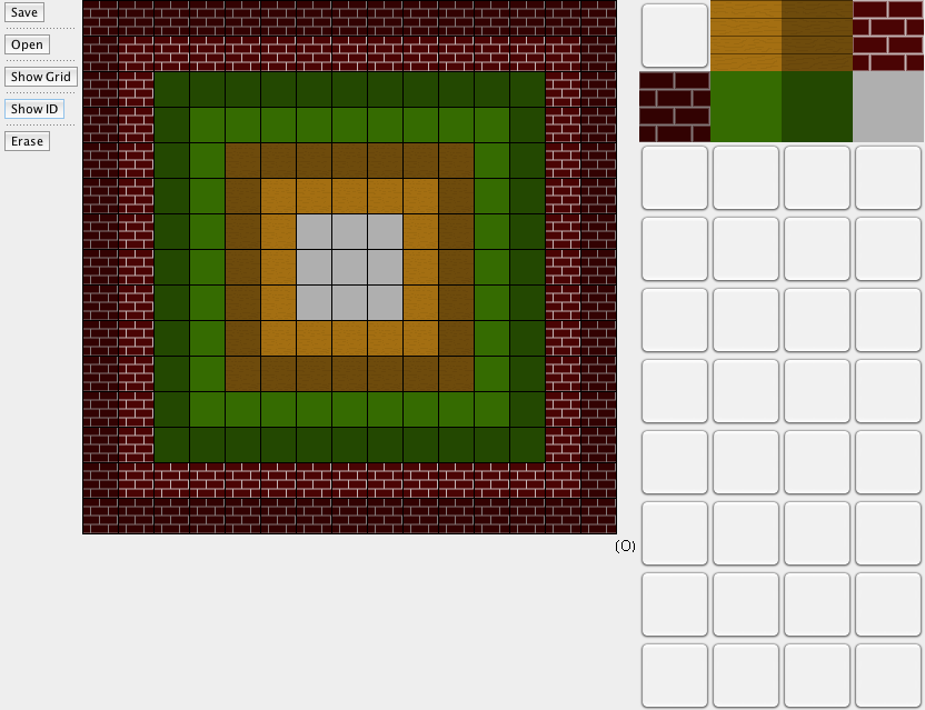
One of my more recent undertakings has been overhauling the way I create levels in the game. Before, I used a system of images where each pixel was a tile in the level, which was tedious and inefficient for a variety of reasons. Memory wise, it required a relatively large amount of effort to load each level. Making the levels themselves was also difficult because I had to use a specific set of colors with precise R, G, and B values to get the desired outcome, and didn’t get to see what the final outcome would look like until I loaded it into the game. Now, I use a level editor that I made myself that really facilitates level making because you can actually see the tiles you’re placing instead of just solid colored pixels.

Although it is a simple editor, it has everything I need to make levels quickly and efficiently. The lighter tiles are floor tiles while the darker tiles are walls. The blank spaces are place holders while I create more tiles to be input into the game.

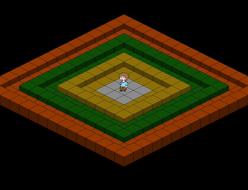
The map I created inside the level editor loaded into game.
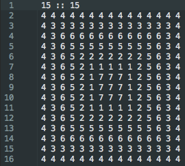
It did take a little while to complete the map editor, and I still have to add objects, but the benefits definitely outweigh the costs. Now, the tile IDs are saved to a text file that can be easily read and made into a tile map that’s loaded pretty quickly.

The text file created by the editor to be loaded into the game. This particular text file creates the level shown above.
When I first thought of making a level editor, I thought the idea was a good one, but backed away because I wasn’t familiar with a lot of the window components needed to make one (for instance JButtons and JToolBars). However, I’m glad I worked through and figured out how everything meshes together because making it was fun and interesting, and I can make levels more efficiently from now on.
If you want to see the game as it progresses in detail, you can visit the github repo here: https://github.com/VolitionDevelopment/The-Adventures-of-Mark
Recent Comments