Tagscience

2018 Winter AI Project – Connect 5 Minimax

After finishing my previous project, I still found myself with plenty of time in-between classes (thankfully I’m only taking 4 courses this semester as opposed to my usual 6, so hopefully this trend continues throughout the semester). Also, as I recently took up a UTA position for CS2505 at VT (Intro to Comp Org), I found myself with plenty of down time on-shift as the early assignments are easy and most students don’t need help as of yet. Thankfully, some friends come and spend time with me to make the time go by faster. One of these friends typically brings a Go board along with her and loves to play connect 5 with us (think tic-tac-toe, but on a Go board, and you have to connect 5 instead of 3). After countless games, I thought back to my minimax algorithm for tic-tac-toe (here), and wondered if it applied smoothly to connect 5. And so, I decided to start working on this project.

First was to create the game. I was drawn to Java because I’m most comfortable working with object-heavy projects in Java (as opposed to something like Python). Coding the basic game was simple. The board itself is basically an 18×18 tic-tac-toe board. As such, I just used a 2D integer array size 18×18 and used constants for black, white, and empty spaces. I used swing for rendering, and KeyListeners for user input. Arrow keys navigate and enter places a piece. Upon placing a piece, control is handed over to the AI to decide the move they are going to take.

Screen Shot 2018-02-05 at 2.24.53 PM.png
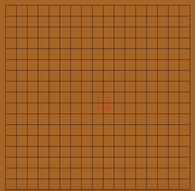
Empty gameboard. The cursor is indicated with the red square (moves with arrow key input). As you’ll see later, the blue cursor (not shown here) indicates the previous move.

Next came calculating the heuristics for scoring any given board. I used this post by Ofek Gila as a foundation and built on that. Essentially, the board is traversed in every direction (horizontal, vertical, topleft->bottomright diagonal, topright->bottomleft diagonal) and consecutive pieces are counted and scored, with the sum total being the overall score of the current board state. The scores for consecutive pieces are based on the perceived value of that shape (i.e. a 5 in a row is worth much more than a single piece). I wanted this version to play very defensively (an annoying strategy for veterans of the game), so there are noticeable score differences based on what the color of the consecutive pieces is. Afterward, I began writing the minimax algorithm. The basic jist of minimax is to look a set number of moves into the future, score the current board state, and play off of the assumption that your opponent is going to make the best move for them at their given board state (hence the name minimax — you’re trying to maximize your gains and the opponent is trying to minimize them). I settled on looking 2 moves into the future, as it fit the balance of running quickly and decent decision making. If you want to learn more about minimax, feel free to look at the code for this project (link at the bottom).

Screen Shot 2018-02-05 at 2.23.14 PM.png
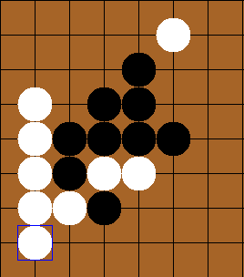
Using minimax, the AI (white) was able to defeat the user (black) here, while also stopping a win for black (if the white piece at the upper-right was not placed, black would have won)

Using this method, I ran into a couple of speed bumps. The major issue was performance. Especially at the beginning of the game, even after the user’s move, there are still 323 possible moves (18^2=324, -1 for the placed piece). That in addition to looking n moves into the future, meant that there are about 323^n checks that the algorithm needs to make (the number is actually slightly less than 323^n, as it doesn’t factor in placing new pieces and repeating the process, but it is essentially that value for small values of n, so we will ignore it for this basic analysis). To solve this, I cropped the board down to only ‘relevant’ spaces (I defined relevant here as any space around all of the current pieces in play with a buffer of 2 spaces on every side). Using this method, I was able to reduce the number of checks for 2 moves from 323^2=104,329 to 25^2=625 (placing one piece and creating a buffer of size 2 on every side creates a 5×5 grid, resulting in the 25 seen there (5^2 = 25)). Other than that, there is a bug in which the AI would let the player win if it won later down the decision-tree (in other words, it detected a win but didn’t take into account the opponent winning sooner). I expect this to be an error with scoring, but as I want to continue working on other projects, I will leave this bug in for now.

Screen Shot 2018-02-05 at 2.21.13 PM.png
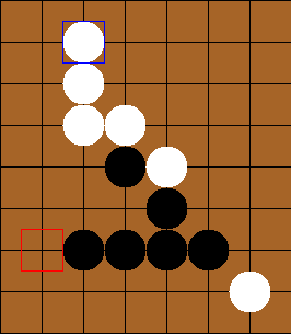
You can see that the AI (white) detected a win, so it ignored black’s 3 in a row, ensuring a win for black.

Testing this out on some of my friends, I found that it played fairly decently. However, due to some minor bugs in the score evaluation (detailed at the end of the previous paragraph), veterans could consistently beat the bot (albeit after hard, long-fought games). This project was a fun one that I could share with friends, so I definitely enjoyed working on it and seeing it get better along the way. I encourage you to download the project and try playing against it yourself. You can find the github for this project here.

2017 Fall Cluster Project – Raspberry Pi 3 Cluster

After using VT’s cluster for so long, I was interested to learn how the computing behind it worked, and decided to make my own cluster of Raspberry Pis. I contemplated the benefits of embarking on such a project and came up with a multitude of experiments I was interested in exploring that would benefit a cluster-like structure, of which include password decryption, simulation for genetic algorithms, and more. What really tipped me over, however, was the already written and free to use libraries MPI and MPI4PY, of which allowed me to use python to write easy to understand and easy to implement code that utilized cluster computing. Thankfully I had a lot of the components on hand already, but I estimate the overall cost to be around $270. This includes the cost of 4 Raspberry Pis, 4 8gb micro SD cards, a stand for the pis, an ethernet switch, 5 ethernet cords, a USB hub, and 4 micro USB – USB cords. There’s a great video series by Tinkernut on Youtube that I used for basic reference when configuring my Pis that I’d certainly recommend you follow along as well if you have any difficulties putting one of these together. If you have any questions about any of the components I used to build my cluster, feel free to email me at [email protected].

For my cluster, I used 4 Raspberry Pi 3 B boards, each running a distribution of CentOS 7 Linux. I decided to use CentOS 7 over a friendlier version of linux (i.e. Raspbian, a distribution written specifically for the Pi), simply because VT’s cluster also uses CentOS. Each Pi is given power and connected to an Ethernet switch that is also connected to my router so I can ssh into each of the nodes.

23846287_1514413558653154_1522017645_n.jpg
Picture of my cluster

I have the Pis set up in a master-slave system, in which the head node takes one big problem and divides it into smaller problems for the slave nodes to compute. This allows me to, say, run genetic algorithm/ANN simulations on the slave nodes while performing breeding and fitness evaluation on the master node. I definitely plan on experimenting with speedups in regards to AI in the future, so be on the lookout.

After building my cluster, I found it fitting to at least write a short piece of test code to see how much the cluster structure sped things up. I decided to time Leibniz’s Pi approximation to the 100,000th term on a single worker vs. all three workers. You can see the results of that experiment below.

Screen Shot 2017-11-22 at 9.04.51 PM
Testing 1 vs. 3 workers

You can see that the test in which I only used one worker (nodelist_small), the runtime was approximately 3 times as large as the runtime when I used 3 workers (nodelist), which is to be expected. You can also see that the estimates are slightly different, though I believe this error to be a result of integer division losing some information when divvying up the work for slave nodes (As this is just a small test, I’m leaving this error for now). You can get the code for this test here.

This was an incredibly fun and practical project to work on during my Thanksgiving break. Definitely be looking for more updates from me as I begin to experiment more with the cluster and what it can do. Hopefully I can run some experiments before my next break, but as exam season is coming up, I may need to focus more on my studies. If you have any questions or comments, feel free to email me or leave a comment.

When idle, my cluster is aiding the BOINC sponsored SETI@Home project. I chose this over other BOINC projects mainly due to it’s friendliness towards ARM processors (of which the Raspberry Pi uses).

2017 Fall Data Analytics Competition – VT/GDMS Health in the US

Moving into the fall semester of my Sophomore year at Virginia Tech, I was a little starved of side projects I could do, simply due to the amount of schoolwork I had to finish each week. However, luckily I was able to make time for a couple projects I could focus on in the side. One of them being is data analytics competition, of which was sponsored by the CMDA club here at VT and GDMS. I participated in the beginners competition in a group of 3, the other members being good friends of mine Eric Fu and Kali Liang. In the competition, we were given a large data set (.csv file) involving health issues across various cities throughout the United States (500 entries). Some examples of the categories, just to get a feel of the type of data we received, included ailments such as asthma, obesity, heart disease, kidney disease, etc. We were also given general data involving disease prevention (i.e. access to health care, going to regular checkups, etc.) and unhealthy behaviors (i.e. binge drinking, drug use, lack of leisure time and sleep, etc.).

I believe that my group’s approach to the data was a rather unique one, given our different backgrounds. Eric is a BIT major, Kali is a CMDA (Computational Modeling and Data Analytics) and Statistics major, and I am, of course, a Computer Science major. As a result of our different backgrounds, we each had different ideas as to how to approach the information to find correlations between the categories. For instance, my approach was to code basic programs in Python using numpy and matplotlib to generate scatterplots and other useful graphs, while Kali was comfortable using R to find more statistics-heavy information (like GLM/LS Means) and Eric was comfortable working directly in the given Excel file to look for correlations.

First, we decided as a group to look for interesting differences in the data by splitting the it up into regions. We explored a number of splits, and we ended up using data from a regional split (NE, S, MW, W), a coastal split (west/east coast, with everything else being lumped into a “main land” group), and a split based on population size to explore the uniqueness of big cities (we defined a big city as any city above 2 standard deviations above the mean population for the entire data set). We also explored a split based on State, but found the data to be too volatile, and with 51 groups (incl. Washington DC), there were still too many points to investigate. My python scripts came into good use here, as I was able to make a quick program that found and graphed the scatterplots of each region for any given category, along with a line that connected the means for each sub group together (with and without outliers) for visual investigation. I also coded a script that plotted scatter plots for any 2 given categories to see if they were related.

OBESITY.pngOBESITY.png

The first graph details the difference in Obesity in the east vs. west coast, while the second illustrates the difference in Obesity in the US Regions.

From this initial stab at the data, we found what we believed to be significant differences between the general health in the east coast and the west coast (meaning the west coast was significantly lower than the east in almost all categories). Also worth noting, we also determined that health in the west region was generally better than the other regions. From this lead, we explored the differences in the means to attempt to understand why the west is generally healthier. We observed that both the west coast and the west region have significantly lower Obesity rates when compared to other regions, and decided to explore that as a possibility (see the mean comparison charts above). We confirmed our assumption by looking at the general trends for obesity and various other ailments and observed that, in general, there is a strong link between obesity and other serious health problems.

figure_1.pngfigure_1.png

Some of the scatterplots we used to illustrate the link between Obesity and other serious illnesses like heart disease (CHD) and asthma (CASTHMA). 

In order to further provide evidence for our assumptions, Kali used regression analysis, specifically generalized linear models with least square means to further look for significance between these groups. Using these tests was helpful because it not only aided at eliminating some of the confounding variables that may be lurking within the data, but made it extremely clear as to whether the data was significant or not through looking at the p-value numerically and with a visual aide. Essentially, when graphed, intervals of the mean are plotted for each region (each interval determined using a 95% CI). If the regions don’t have any overlapping points, then the difference between the two can be considered significant and is definitely worth looking into. As you can see below, we were able to confirm our assumption that the difference between obesity rates in the east and west is significant.

Picture1.png

LSM Chart confirming our assumption that the difference in Obesity rates in the east and west coasts is significant

However, we were not satisfied simply stating that we recommend that Obesity rates be lowered, so we looked into possible variables that could affect Obesity that weren’t already included in our data set. Ideas for this included finding density of fast food restaurants within each city, and measuring the nutritional differences between each city. Unfortunately, we were unable to find any reliable data on density of fast food restaurants, but we were able to pull data from the CDC website pertaining to amount of people that ate less than one fruit and one vegetable per state in the US. Using this data, we first confirmed the link between not eating nutritional food and obesity, then went on to make our recommendation. Eric’s background in Business came in handy, as we gave various recommendations that made sense from an economics point of view (i.e. decrease the tax or cost of fruits and vegetables in obese regions, subsidize farmers to increase fruit and vegetable output, or push advertisements encouraging people to eat healthier).

As a slight aside to our main focus on Obesity across the US, we also found that Stress (we defined stress as a lack of leisure time (LPA) and a lack of sleep) was high in big cities. We noticed that not only were kidney problems slightly higher in bigger cities, but so were other ailments such as strokes and diabetes. We were able to link the connection between stress and diabetes with kidney problems (seen below), and further connect kidney problems with strokes. Unfortunately, due to the time constraints for the competition, we were not able to explore these connections much deeper. However, given more time, we definitely would have done so.

SLEEP.pngfigure_1.png

Mean comparison showing increase in lack of sleep in big cities and scatterplot showing the relationship between sleep deprivation and kidney problems.

This competition was extremely fun to participate in. Unfortunately, we did not place in the top 3 teams for our section, although we did get an honorable mention. I want to thank GDMS and the CMDA club at VT for making this a reality. I’ve always been interested in data analytics due to my background in neural networks, and it was incredibly fun to work on something data analytics related even though I haven’t been able to take any statistics courses as of yet.

If you’d like to see any more plots, or would like to see the scripts I made for the purpose of this competition, feel free to email me at [email protected].

© 2024 Brendan McCloskey

Theme by Anders NorénUp ↑